For the past 12+ years, I’ve been creating a calendar-based wallpaper every month to share with the world. It’s been a fantastic exercise to keep this up month after month, allowing me to try new techniques and use it as a platform to share my photography.
This month, I thought I’d share a little behind-the-scenes of how I create a glitch technique and provide some insight into the overall process of working in Photoshop and saving each resolution. I’ve used this technique a lot recently.
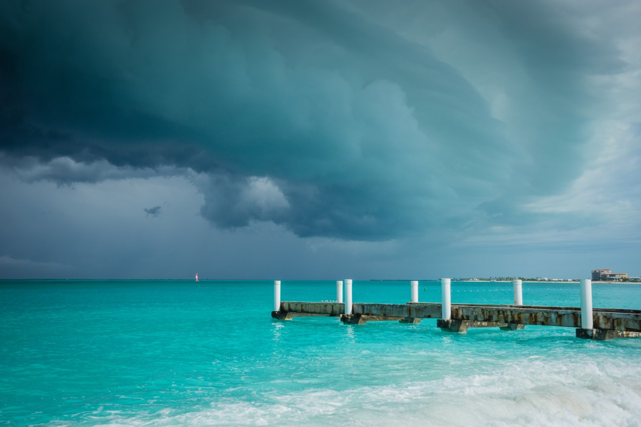
First, I started with a photo I took at Turks & Caicos in November:
I then run the photo through an app called Processing. There are various scripts you can download to use with it; I’ve been using one called PixelSort. This is the outcome using the base settings:
![]()
After that, I take it into Photoshop to decide what to do next. With this shot, I really liked the pattern that formed in the upper left corner, so I decided to use that as the base of a symmetrical layout.
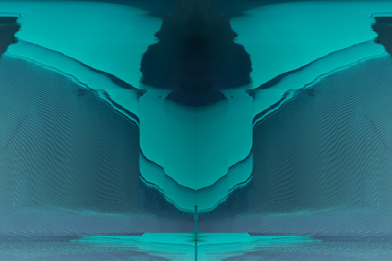
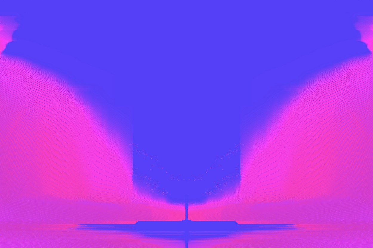
I then play with different color adjustments until something speaks to me. No rhyme or reason, really, just what looks cool to me. Here’s where I landed:
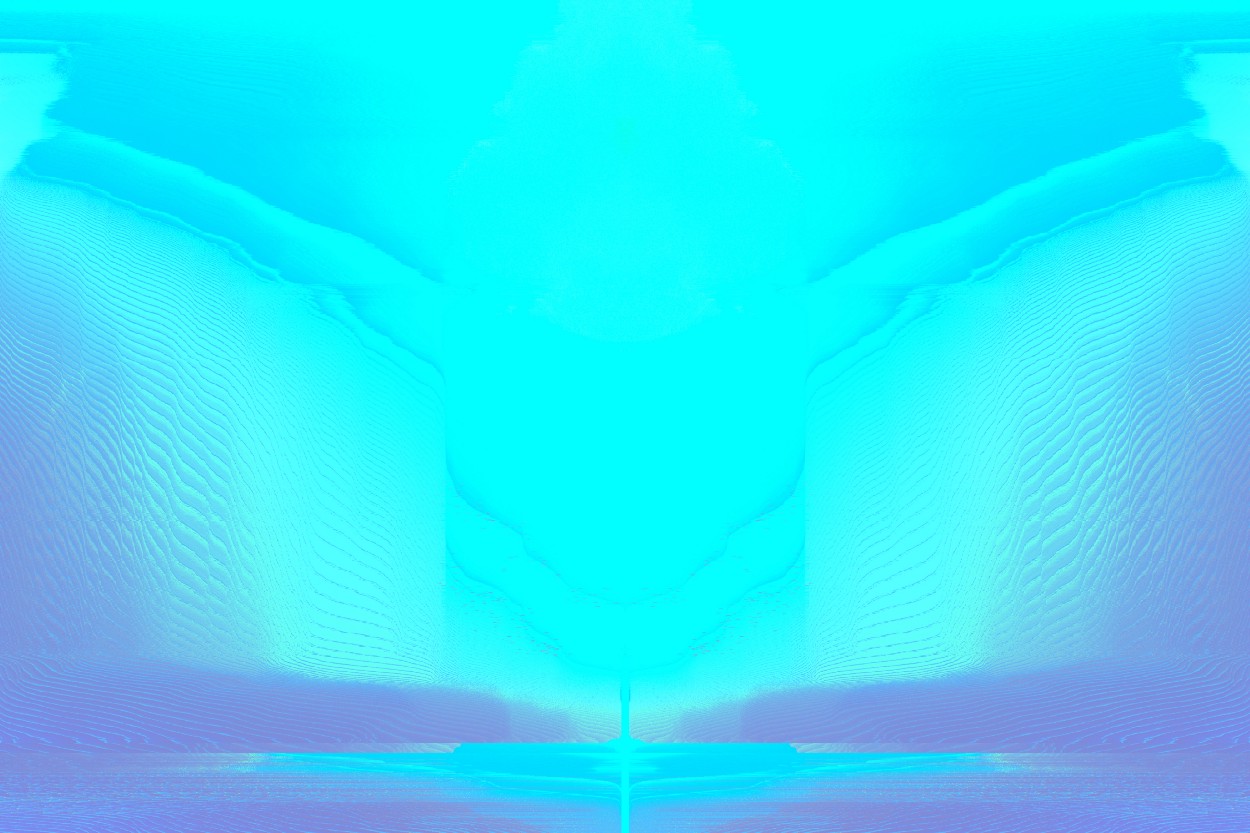
I then take the color processing further. I liked the softness of the blue, but wanted to go more red/pink for the month of February (I know, cliche…):
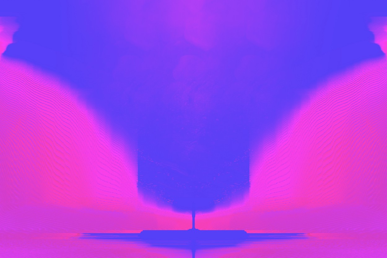
I really love how this pattern came out. The top section became more solid, and it looks like something was floating above an island. Which is pretty fitting since the original photo was taken on an island! I then added a bit more texture to the image:
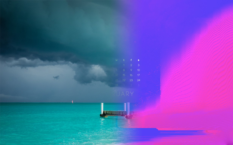
It was time to add the calendar. Over the years, I’ve played with various type treatments for the calendar layout — traditional square, in a single lines, etc. — but in the end the feedback has always been most positive for traditional squared layouts. I’ve been trying to keep that layout for the past few months/years as best as I can. I pick out a typeface that seems to work with the theme.
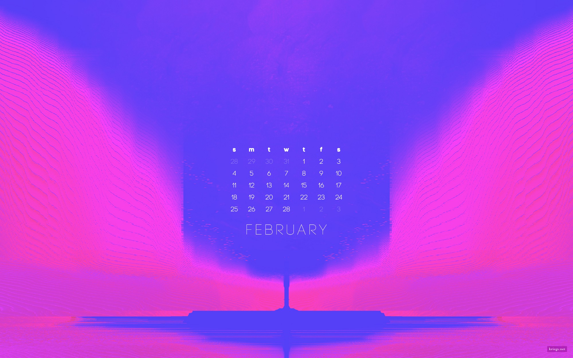
And there you have it! A finished wallpaper. I add a watermark to the corner and add copyright/image information via File Info in Photoshop before saving. If you want to download this wallpaper, you can it in the Wallpapers section. It’s available in resolutions for desktop, mobile, and tablet devices.
One last bit behind-the-process . . .
Last year I decided to really streamline the resolutions I offer on my site. Checking my site’s analytics, I noticed a handful of resolutions were the most downloaded. I decided to narrow it down to one resolution for desktop, one for mobile and one for tablet that would work across various devices. This also made it quicker for me to create each wallpaper and get it ready each month.
Since converting to this method, I’ve streamlined the process in Photoshop:
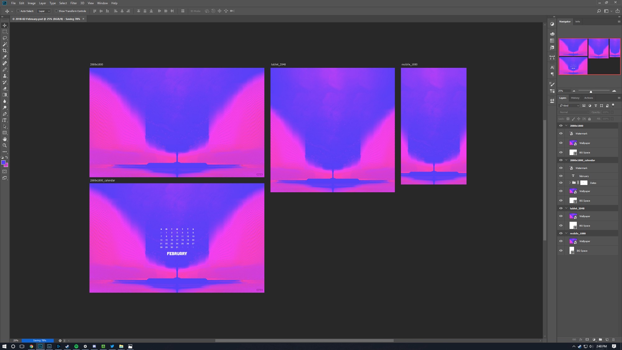
In the PSD, I have an artboard set up for desktop, desktop w/ calendar, tablet, and mobile. I have a Smart Object shared in each resolution that houses the main artwork. I edit the artwork there, and it’ll propagate to all 4 options. The dates for the calendar variant are done outside the Smart Object. I can simply hit Export and all four variants are saved. I try to upload the wallpaper a few days before the beginning of the month.
I hope you enjoyed this look into my process and hope it sparks some inspiration for your next project!
I wrote this originally to share on Medium.