Warhammer Online was an MMORPG released by Mythic Entertainment (EA Games) in September 2008. At its peak, the game had more than 800,000 registered players across servers in North & South America, Europe, Asia, and Australia and sold more than 1.2 million copies. Due to a license agreement coming to an end with Games Workshop, the game shut down on December 18, 2013.
My Role
I was brought on as the first digital designer for Mythic Entertainment. My role as Web Design Lead was working on the UI as well as front-end development (basic HTML/CSS/JS templates) for just about all of Mythic’s websites from 2007–2010.
Project Overview
When I joined the studio, the positive energy at Mythic was through the roof, and work was already underway on the Warhammer Online game, but the web properties were still to be fully defined—just some basic pages for the game were in place since the game was announced.
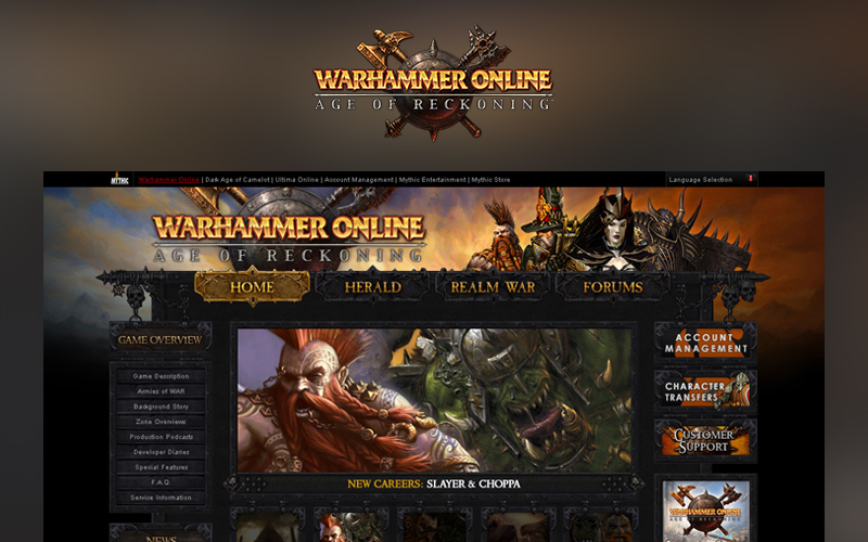
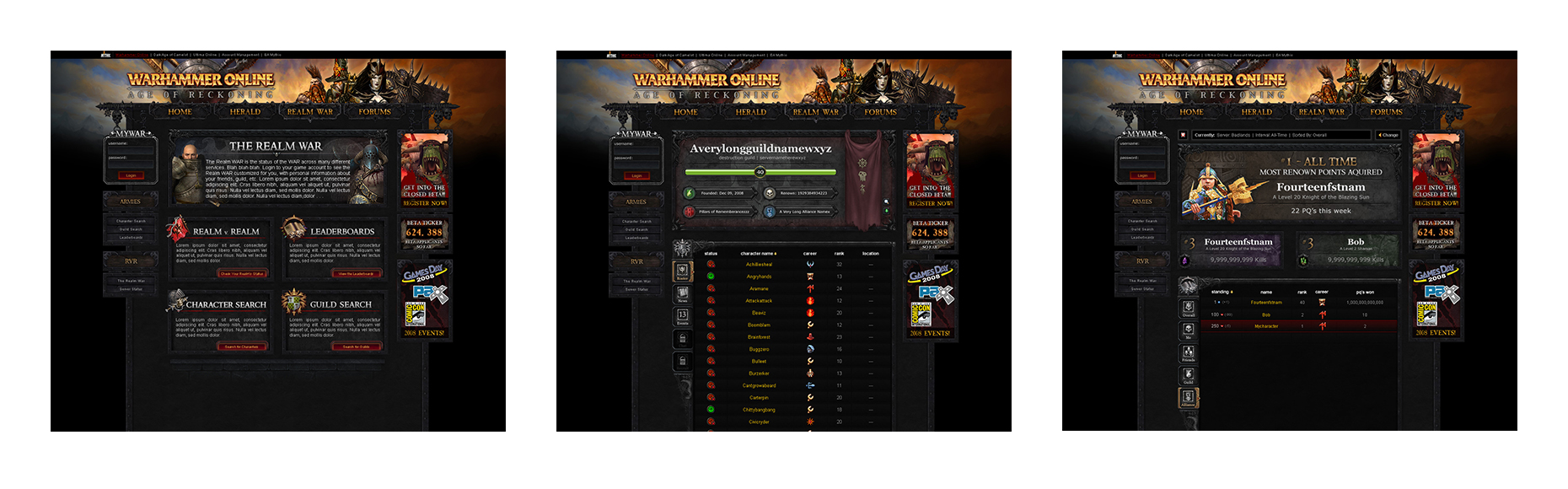
The first project I was tasked with was getting the Warhammer Online web properties ready for launch of the game, which consisted of three sections: Home (marketing and game information), Herald (community blog), and The Realm War (in-game related content accessible when the user is logged in). The task at hand was to figure out how to lay these out into a cohesive experience and then design the layout. On top of that, I worked hand in hand with the back-end developer for the entire process, as writing the front-end code was also under my purview.
Challenges
- Our biggest competitor in the scene was Blizzard’s World of Warcraft. They were working on an expansion around the same time Warhammer Online was in development. Per the marketing teams, we had to avoid any design decisions already in place on Blizzard properties. This included some common web design practices, like full-bleed images in the background of the page.
- The Warhammer brand is an IP owned by Games Workshop. As such, any component of the game that depicted characters, worlds, and more would have to be signed off by someone at Games Workshop for both the game itself and the website (if not already approved for the game).
- The art teams were running at full tilt. We didn’t have any time before the launch to leverage them for unique assets. I was granted access to the share servers to use pre-approved in-game assets and concept art.
- Mythic would be partnering with GOA (part of France Telecom’s Orange’s Content Division), who would handle our web presence for the European players. They’d be using most of our designs as templates for their pages. When designing the pages, I had to keep localization in mind. This was easier to manage for navigational components, but trickier when designing for the Realm War, which featured player-generated user and guild names. After talking to the Dev Ops team, I was able to get the database limitations for the player-generated content so I could design with those limitations in mind.
- Time. The web team was a two-person team (me and the back-end developer) working on a major web project that would be viewed by thousands of potential of players. How could we best streamline the process to hit our milestones?
Research
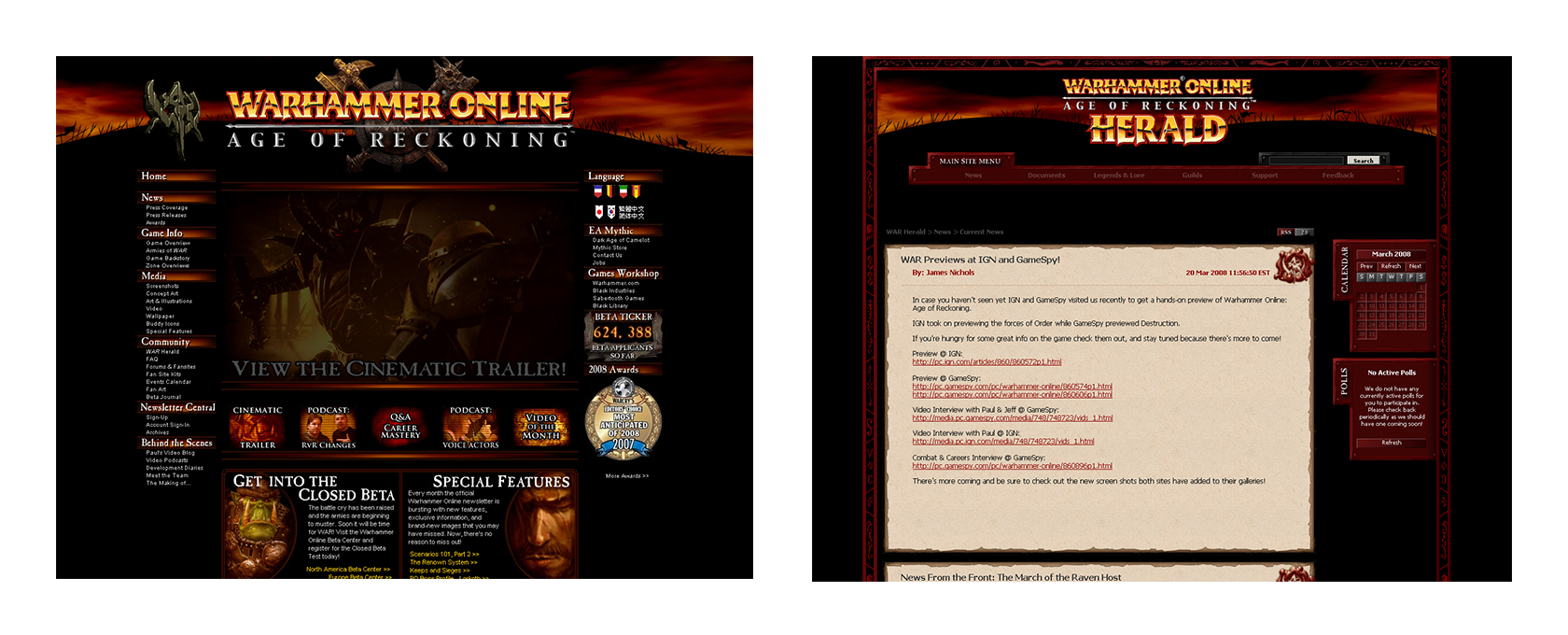
There was no set direction for the web properties. Each team had previously worked on their section without consulting the others, so the two existing pages had their own looks. To kick off the project, I began with talking with the teams that would have a hand in each component of the experience:
- The Homepage experience was overseen by the marketing team. This section would house all the core material for the game: core game information, including background of the story, army information, and game requirements, as well as press releases/coverage, awards, and newsletter signups.
- The Herald would be maintained by the community team. It would be a blog-like experience for them to share new information about the game, the development team, and more. The current system was a custom-made CMS system developed by the back-end developer, so we didn’t have any limitations by using an existing system.
- Realm War wouldn’t be maintained by a team since it was live user data, but I began by talking with the development teams involved in Player Content, Guilds, and in-game Realm v. Realm (RvR) experiences as well as the Dev Ops team to see what data we could display for the users.
- Gamers, especially those of massively multiplayer online games, have a lot of time and emotion devoted to their characters and factions. With this in mind, it was best to keep the site as faction-neutral as possible so the player base wouldn’t think we favored one over another.
- Even though the three sections of the website experience worked as their own mini site, I wanted to make sure the design made them feel as uniform and part of the same ecosystem as best I could. This would be anchored by a shared navigational component.
- Per the marketing team, the “hill” graphic featured on the original Home and Herald designs needed to stay. I pushed and pushed for a clear reason on why, but I always received a vague reply that it was just required.
Design & Front-End Development
After talking to each of the teams and gathering requirements, I started to explore some possible directions for the core look of the sites.
My goal was to leverage as much in-game (pre-approved) assets as possible so that:
- It would cut down on the approval time we’d need as a small team and let us work fast.
- It could help strengthen the players’ ties to the game when visiting the website. At times this would prove to be a bit painful, if art was reworked or was taking longer than normal to be approved or designed.
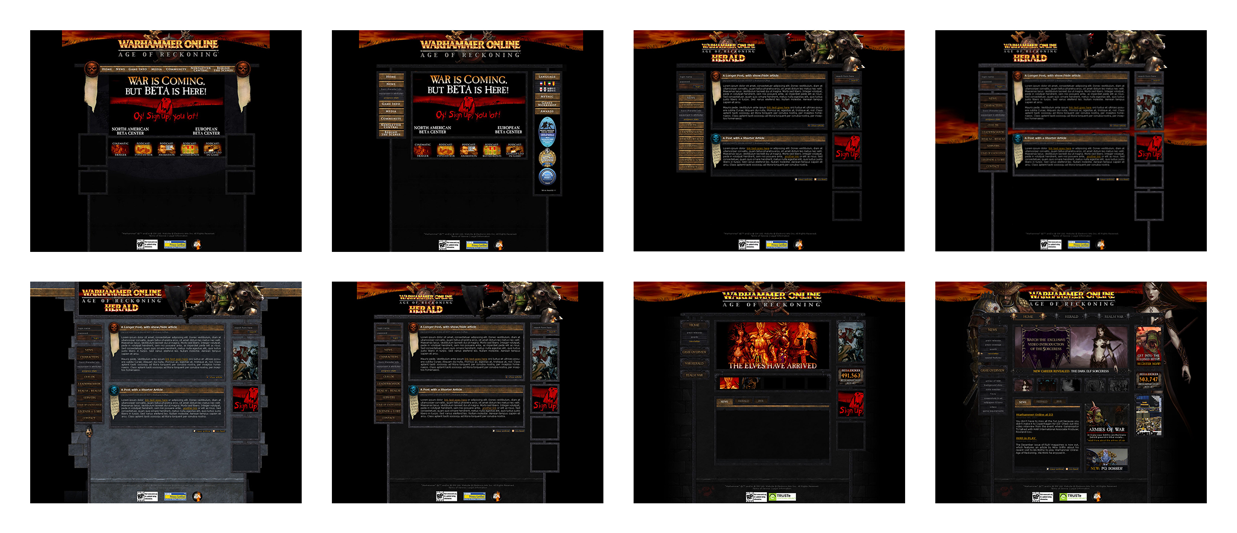
I started with the Homepage and the Herald first because they were already live and visited by potential gamers. After those two pages were established, I’d work on the Realm War section (which wasn’t needed until BETA and Launch). A few iterations and quite a few meetings later, I landed on the initial look for each of the sections that we would use for the launch of the site.
- Each section of the trio of sites had the same universal look. This would help development go faster, due to the core site’s image assets being reused; housed in one location server-side, the each image needed to load only once for all three sites.
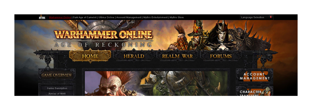
- The top navigation would not only be the way to navigate between the three sites but also serve as a breadcrumb to know which section the user was currently viewing.
- The left sidebar was used as subnavigation for each section.
- The right sidebar was used as an ad space for marketing as well as section-specific quick links like Server Status and Account Management on the Realm War section.
- Each section had a hero image slot at the top for major announcements. The Homepage featured a five-image carousel to showcase more featured content for the marketing team.
- The blog post entries on the Herald had unique icons for each category so the user could quickly tell which kind of content they were looking at (news, patch notes, developer diaries, etc.).
Once core layouts were far enough along, I transitioned to development. Since I was both the designer and front-end developer, I was able to take less time working out every interaction and state of an asset and work on it in code. This helped decrease the amount of time spent on design and get the coded front-end pages to the back-end developer more quickly. I worked primarily in Eclipse, so the HTML pages were easier to hand-off to the developer, plus it allowed us to check in/out pages so work wasn’t lost or overwritten.
With all hands on deck, after I got ahead of my milestones, I was able to assist other teams and needs, including:
- Working with the Operations team (which the web team was part of) to work on the Account Management website so users would be able to register and pay for game time.
- The Operations and Game team also leveraged my time to create a UI for the game’s patcher/launcher. This is what the gamer would see when they first fired up the game. I had this match the same design language I was using for the website. It had gone through a few variations during beta and live versions of the game.
- The Marketing team really enjoyed my personal calendar wallpapers and asked if I’d be interested in making some that were game-themed (for 2008 and 2009). I had a lot of fun creating these after hours, using approved concept art, and we even tried to time them with character and race reveals.
Release
Release was handled in stages: Pre-BETA, BETA, and Launch.
Pre-BETA release consisted of the Homepage (marketing site) and the Herald (community blog). These were front-facing, and since the game was still not released, gamers were able to get more information on the game each week as new information came out.
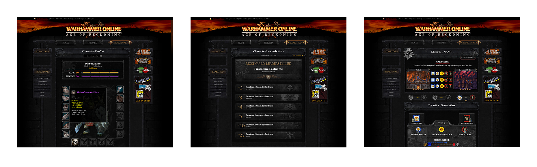
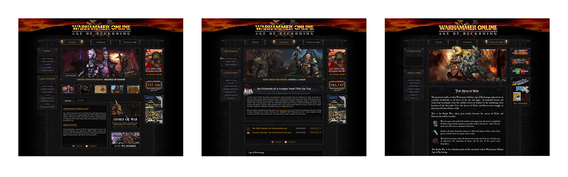
Once the game entered public BETA, we launched a BETA for the Realm War. Gamers in the public BETA could login and test out viewing their Character information as well as RvR Leaderboards for their server. Later in BETA, when Guilds were introduced for testing, we also added a way for users to check them on the site. The RvR status page was the last to be implemented and the biggest draw for the site, allowing gamers to check the status of various realms, battlefields, and their capital cities. Having the time to beta-test the realm war component of the site was a huge help and the community was fantastic with their feedback.
When the site went live for Launch, we had a few design adjustments to make:
- Account login areas were added to all three sections of the site. This allowed the user to login on the Home section and still be logged in for the Realm War section.
- Created a Global Navigation strip at the top of the site so gamers could visit other games that Mythic had created as well as accessing their accounts via the Mythic Account Management. A location selector was also added, which would take users to GOA-handled versions of the site if anything other than English was selected.
- Slightly redesigned landing page for the marketing site.
- An updated version of the Realm War homepage, based on if the user was logged in or out. It was a bit more descriptive on what the user could expect out of this section of the site if they were new to Mythic Entertainment MMOs.
All in all we had a fantastically smooth launch experience, not only for the website but for our game and servers. Great planning and execution by the teams!
Post-Release
The first few weeks after Launch, time was spent addressing bugs and adding assets that didn’t make it into the Launch version of the game, which were mostly found on the Realm War sections of the site. Then I got to work on making some UI improvements across the board, which included:
With the game released, we were finally able to get on the Art team’s schedule. I worked with them to create a unique composite background image, and we were able to finally get rid of the “hill” design. Some characters from both major factions were added to the header as well. Following the release of the game, Forums were added to the site, so it gave us some time to rework the navigational design as well.
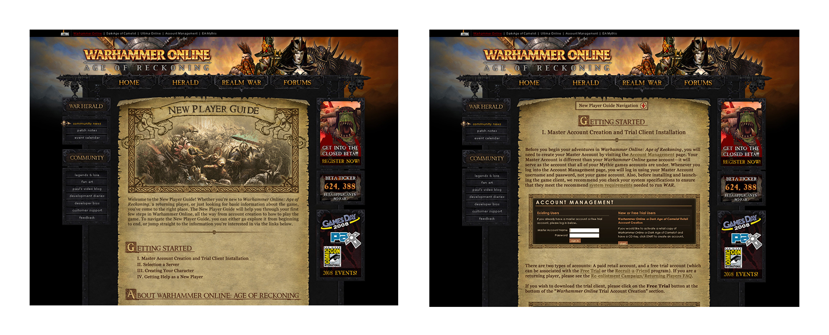
I worked with the game and marketing teams to create a New Player Guide that lived on the Homepage. This was a step-by-step multi-page section that would guide players through the entire game experience, from creating an account and character to end-game RvR battles. Again, I tried to use as much in-game style assets as possible.
UI changes were designed but never implemented for Realm War page redesigns for Character, Guild, and Leaderboard information. Also planned was the ability for players on the web to chat in-game with their guild-mates and an iOS companion app, but both features were scrapped due to time/resources.
Interested in more? Check out all my work for Electronic Arts / Mythic Entertainment.