MakerBot’s Thingiverse is an online design community for discovering, making, and sharing 3D printable “things” that was launched in 2008 (predating MakerBot itself). As of spring 2018, the site featured more than 2 million user-submitted 3D printable files and about 3 million monthly unique users.
My Role
I was brought on as the first digital designer for MakerBot, joining the newly formed Digital Products team as a UI/UX designer in early 2013. Thingiverse would turn out to be my core focus during my almost four years at MakerBot.
Project Overview
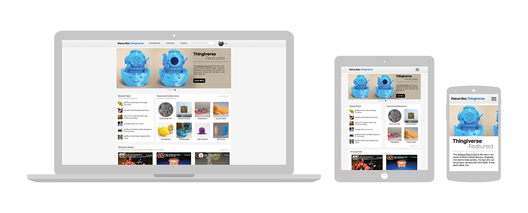
The first project was a refreshed design for Thingiverse, focusing on updating the UI and making the site fully responsive. The site pre-dated MakerBot itself and was overdue for an updated look. I remember on my first day, every employee I talked to was super excited to hear the site was going to have a designer and get an update.
Around the same time I came on board, the company saw a large influx of new hires, including multiple developers and a project manager for the Digital Products team. The project manager introduced everyone to the Agile process (something new for just about all of us) and decided we’d be working in two-week sprints, with design trying to be at least one sprint ahead of the development team. We then broke down the site into chunks and focused on each for a sprint (or two if needed): Explore (main browsing page), Thing Page, User Profiles, and the Home Page. After these sections were launched, we’d go back and work on a similar sprint structure for design changes to other areas of the site.
Research
To kick off the redesign, I first looked at the analytics to see any patterns on screen sizes, devices, and top countries that visited the website. Localization wasn’t something that was on the radar, but I thought that to future-proof our designs, keeping some of this in mind would be beneficial. There wasn’t much user feedback gathered before I arrived, and due to quick deadlines, I didn’t have the chance to reach out to users directly. So instead I talked to other employees at MakerBot who had used the product.
From there, I moved to taking inventory of each section of the site, picking out common elements, interactions, and components. I had two other UX designers on the team (both busy with hardware UX needs), but I was able to leverage their previous knowledge of the product for what components they thought were key to the product and experience.
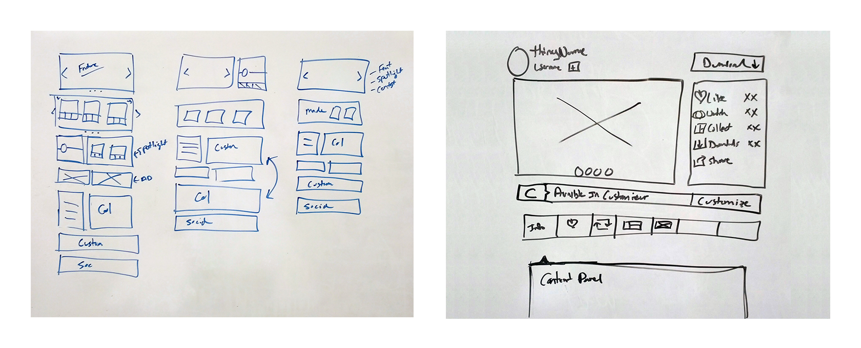
I started to sketch out concepts/layouts on paper and on the whiteboard to get some quick feedback from the developers and other members of the Thingiverse team. Due to tight timelines, I skipped the wireframing stage and went straight to designing in Photoshop. In the years to come, we would refine the design process to include more time for wireframing.
Design
One of the core challenges of designing for Thingiverse was that the product was treated as a separate entity from MakerBot. This was a home for ALL 3D-printing enthusiasts, even those who were not users of the MakerBot product. With this in mind, keeping the brands separate visually was a good direction. Blues/whites/grays (a departure from the blacks and reds used with MakerBot) had already been established, so I kept them but strengthened the palette and tweaked the blue to be a bit brighter.
The site was also previously built using Bootstraps, so a lot of UI components were default from the package. To replace these defaults, I worked to create our own visual design language that included buttons, form layouts, and iconography. These new graphics were then rolled out on each redesigned section of the site.
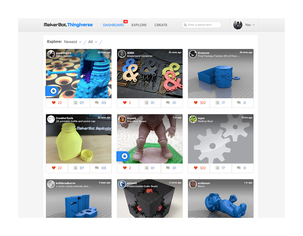
The first page I focused on was the Explore section of the website, the core browsing experience. A small “card” design was given to me when I started that would be featured in an iPhone app (being outsourced). I wanted to keep these components similar and used it as my baseline. Little “badges” were created that would overlay on the card to help call out specific Things that were Featured, Challenge winner, Customizable and even Unpublished (if it was your design).
Using the cards, I decided on a three-column grid layout that would lend itself to a desktop/tablet/phone responsive breakdown. This grid was used for every other section of the site moving forward. I also used the time to clean up the navigation bar and footer designs as well.
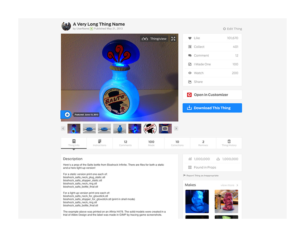
On the Thing Page, I wanted to group up all actions on the page to the top portion. Previously, liking, collecting, etc. were scattered around the page. By grouping them, the user could have one area to focus on when taking actions on a Thing. Content on the page could become very busy, and to allow for planned features down the road, I took the page into a tabbed content direction instead of having everything on one page. This was done for two reasons: 1) to decrease load times of the pages and 2) to better group and section content into Overview/Description, Comments, Thing Files, Remixes, and Collections. This gave us more freedom to expand on each of these sections a bit more by giving them more space to present the relative content.
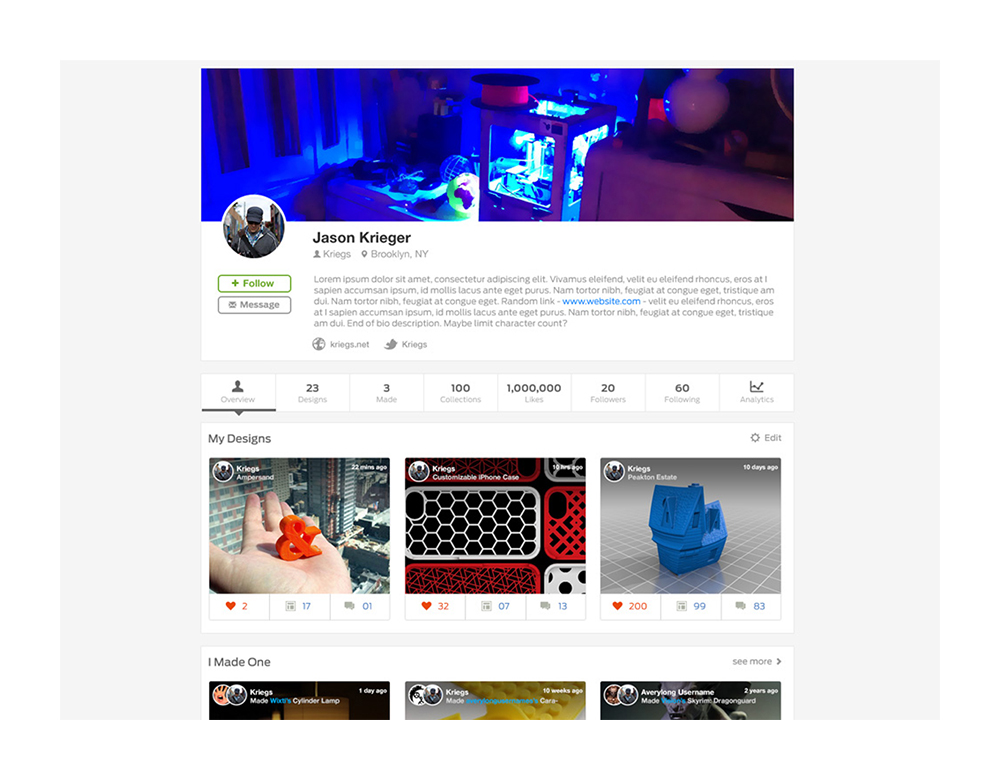
User profiles were given much more information and customization for each user. Avatars already existed, but we introduced profile cover images and more bio/information components. This gave each profile more personality and could serve as an online portfolio for 3D designers. The additional information components were added so we’d be able to later provide more ways to fine-tune searches for users.
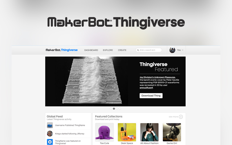
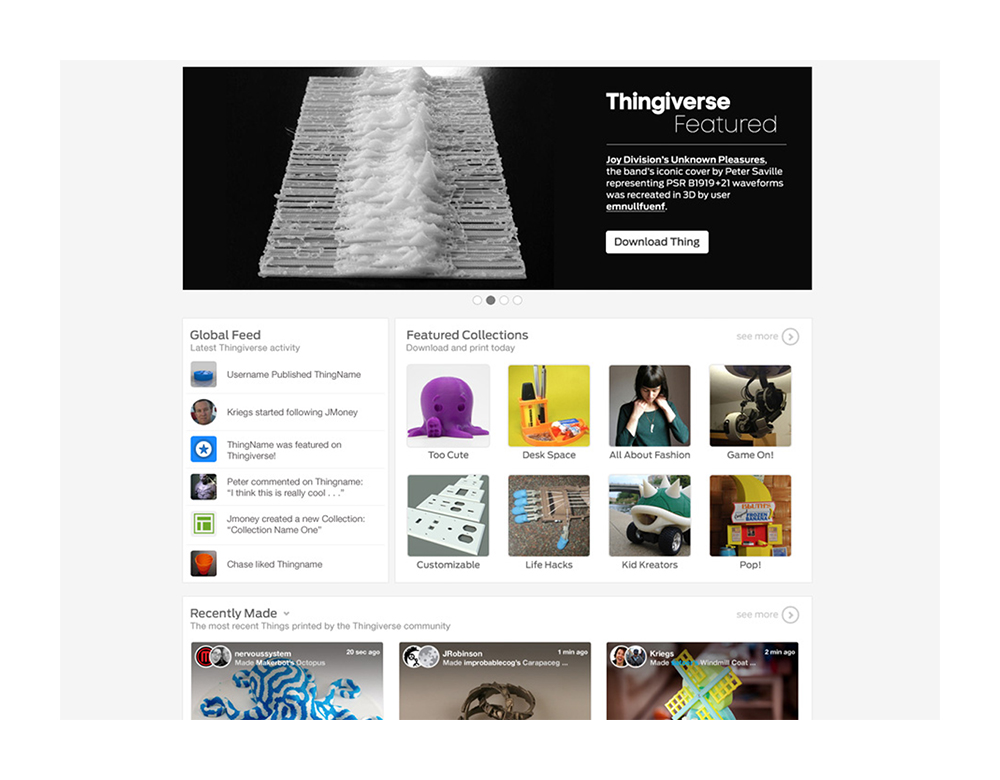
The last component of the initial redesign was the Homepage. I wanted this to be all about the users and content. “Name in lights” was my goal, with the top component of the site housing a full three-column takeover graphic that would spotlight the very best 3D printable content, users, and more. Below that, a live ticker was added to show activity on the site and the ability to quickly jump to featured collections. And below that were modules that allowed us to change what we could feature, be it recently “Made” items, Things of a certain category, and more.
In the end, we had a design refresh that was very clean, minimal, and not a complete overhaul that might alienate our established user base.
Release
Once designs were completed and ready for hand-off, I sat with each developer to see how to we wanted to proceed with asset hand-offs (were they comfortable slicing components from a PSD I provided, or would it be better for me to slice the assets). For the community manager, I created templates for sections of the site they would be editing daily, including the featured graphic, challenges assets, and social posts.
After each section was set on our internal staging environment and approved by our in-house QA team, we would release the updated designs every few weeks, starting with the Explore section. We were able to gather feedback one section at a time which helped us react to, fix, and iterate on each section and also allowed me to take that feedback into other sections still in design/development. I was a bit worried that the staged roll-out would be confusing or annoy the users, but thankfully that ended up not being the case—they were excited to see the new layouts and were quick to share their feedback.
Post-Release
After the initial four sections were live, redesigns of the Dashboard, Challenges and User Settings pages were rolled out every 2 to 4 weeks.
After these pages were released, all design and development on Thingiverse was put on hold to prepare the company’s core website experience for CES 2014. This meant that a few sections and one-off pages on the site never got updated. The process at MakerBot was always “full speed ahead,” focusing on what’s next, so getting time on the roadmap to go back and replace components that weren’t changed in this initial redesign essentially never happened. The team, well aware of our growing tech and design debt, pushed to address it, but sadly our pleas fell on deaf ears on the Leadership teams.
Interested in more? Check out all my work for MakerBot Industries.

