Client: MakerBot Thingiverse
My Role: Senior Creative Director (UX)
The initial responsive redesign in 2013 of the site helped establish the look and feel of the site. But as the years went on, it started to show its age and I tried to usher in design changes that would align better with what we were doing on the MakerBot side of things (iconography, typography, form design, etc) with our newer feature additions.
On the side in 2016, I started to explore what a visual refresh for Thingiverse would look like. Not only serving to update the look of the site but also unify the overall design for the property across all platforms. A navigation refresh, updated card UI and the beginnings of a style guide were done. Unfortunately, I had left the company before any of these could be brought to life but I did leave them for the team, in case a new designer was brought on board or if the development team had runway to focus on UI updates. But sadly, it doesn’t look like the team got around to implementing any of these changes, thus I wanted to share them here…
Navigation Refresh
The core navigation of Thingiverse had remained mostly untouched since the 2013 refresh, with the exception of a few new features added to the heading. But with the recent update to Search, we wanted that to be the core focus on how users explored and found content on the site.
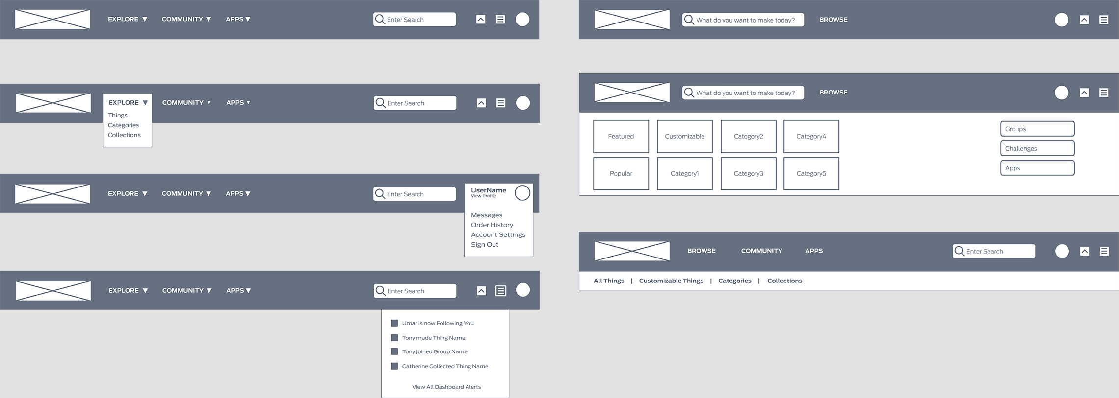
I started be exploring two different concepts for the refresh. The variation on the left focused on cleaning up what was already on the site but moving the Dashboard to an activity feed style near the profile as well as messaging alerts. This kept all the user focused items next to one another. On the right, was the direction the team all agreed would be the better way to explore, with the core focus being on search and every other link under a Browse category (where links to various sections of the site would live).
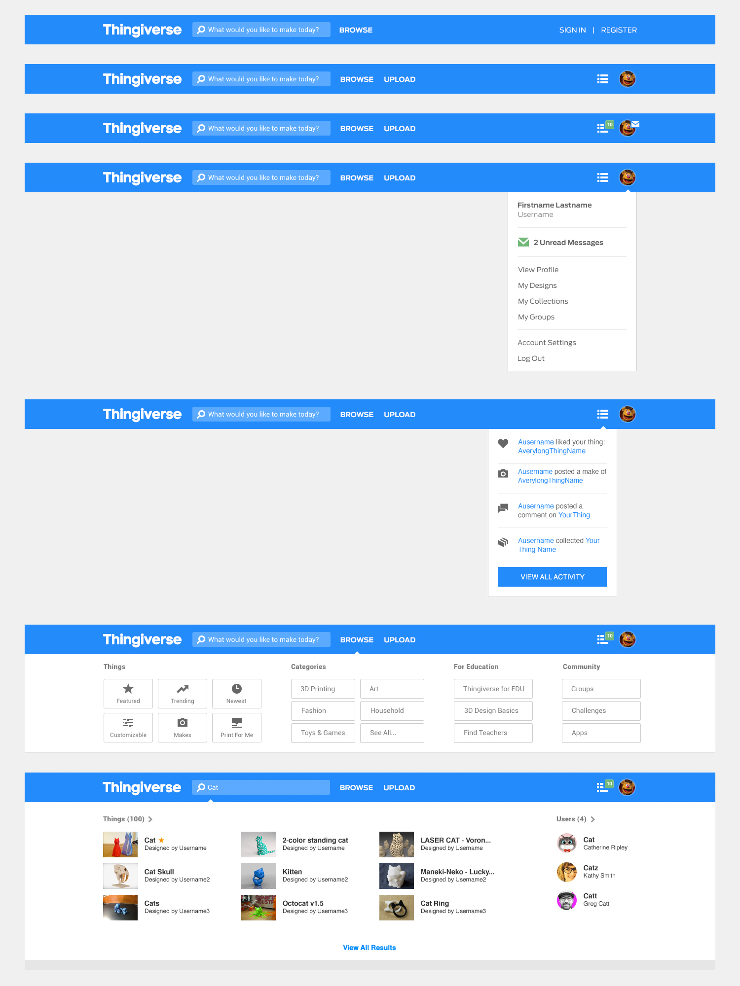
We have a really beautiful blue color featured on Thingiverse and I really wanted to use that as the anchor of the new navigation. It’s something I had already started to use on the Android App so this would help with design constancy across the Thingiverse brand. The designs mimicked the concepts from the wireframes. With the big focus on Search we wanted to show more content as the user typed, using predictive text from the new technology we were using on the backend. From here, we could show example content for various content types on the search. Clicking “View All Results” would go to a full results page for more filtering/sorting options.
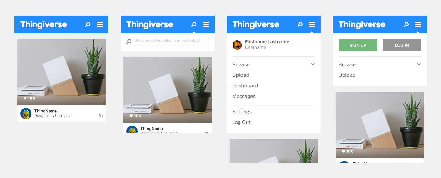
And with the site being fully responsive this also gave us the opportunity to overall the mobile navigation function. One of the main things I wanted to address was the Search functionality on our mobile responsive version. The current version hides the Search feature in an off-canvas panel which saw lower engagement on mobile visits. So bringing that to the foreground would be a huge benefit to our users. I also took the opportunity to just remove the off-canvas functionality together, bringing the interactions onto the main screen.
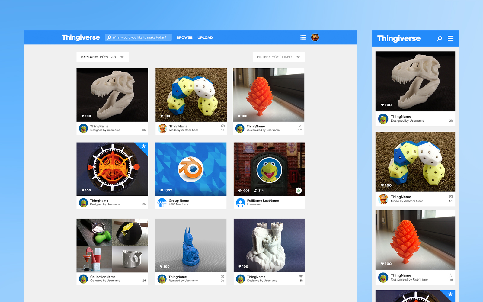
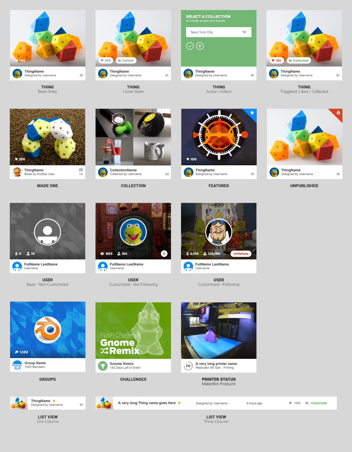
Card UI
When I first worked with the redesign of the Thingiverse website, the initial Card was given to me to build the site around. It worked well for Things but some interactions were used more than others and often times. Also, when building out new features on the site Cards were designed individually for each feature. It was time to sit back and look at all the features as a whole and how an updated Card system would look. This would also open up to being used within the entire MakerBot ecosystem (as represented by the Printer card in the image below). One last bit I wanted to explore was a grid component of the cards. This would allow us more freedom when formatting content on our sites (toggle between card/list views).
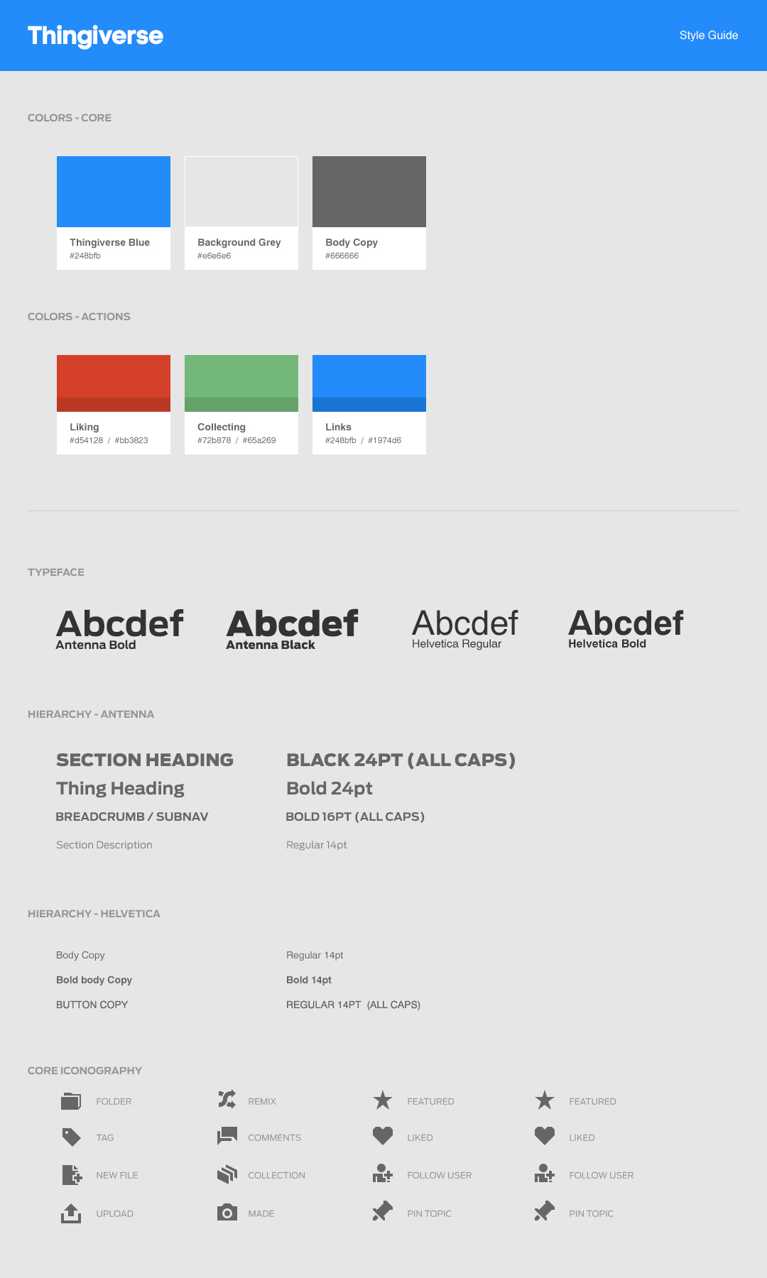
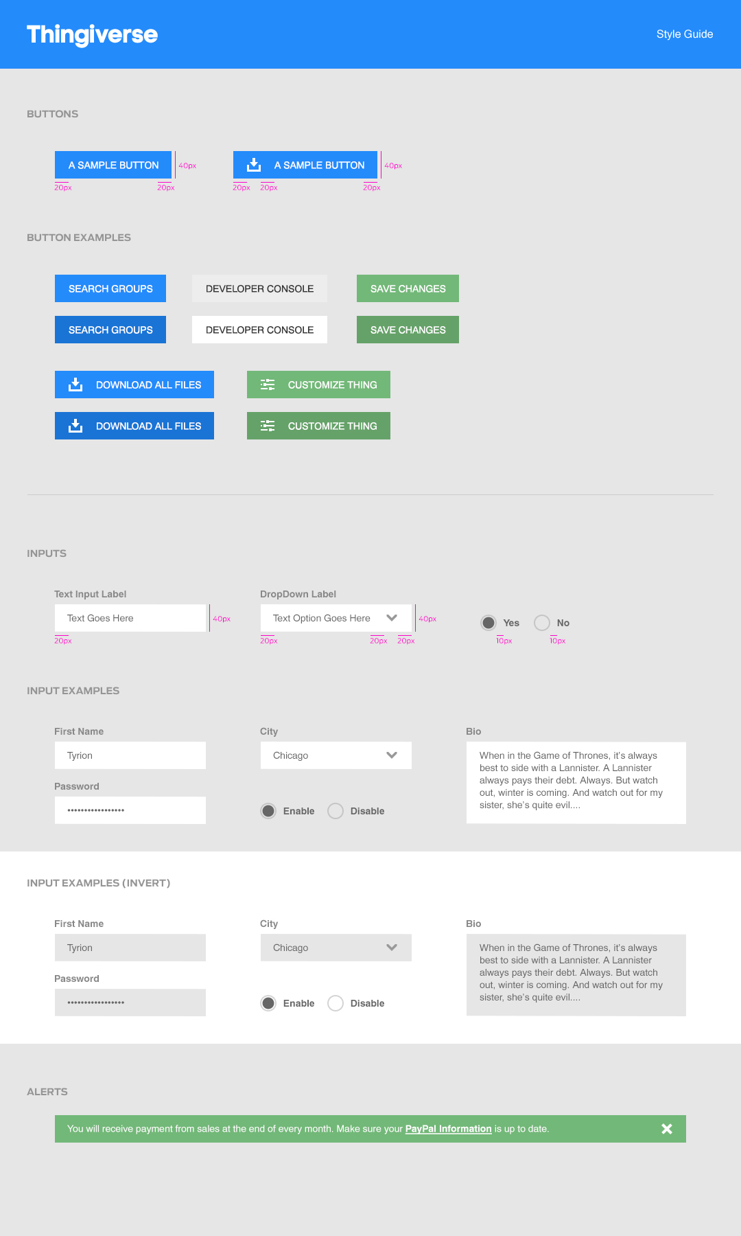
Style Guide
The site not only had a lot of technical debt, but also a growing design one as well. Some sections still hadn’t been updated after the 2013 refresh and we had different look search/button interactions across the site. With a card UI and updated Navigation design language set, I wanted to set aside time before leaving MakerBot to work on the start of a Style Guide to help the team have a system going for when they got time to adding new features.
The guide focused on color, typography, iconography and input methods.